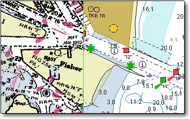
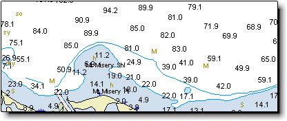
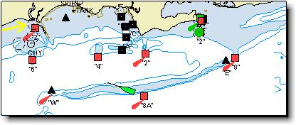
VECTOR CHART running on Visual Navigation Suite. Note chart clarity and detail, orientation of descriptions and soundings and object properties.
Differences between Vector and Raster Charts
This page is inspired by: Bellingham
Chart Printers
|
|
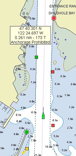
VECTOR CHART running on Visual Navigation Suite. Note chart clarity and detail, orientation of descriptions and soundings and object properties. |
There are significant differences between raster and vector chart
technologies. As with many things in electronic charting, you must see them to
appreciate the differences.
This web page graphically displays
some of the differences between quality vector charts and traditional raster
charts. The image to the right is a vector chart running on a prototype version
of Visual Navigation Suite. The image below and to the left, is a traditional
raster chart (for the same area) also running in Visual Navigation Suite. Those
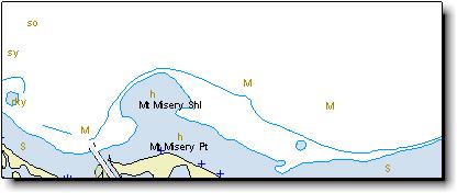
that are from the Northwest will recognize the area displayed as the entrance to
the Hiram M. Chittenden locks in Seattle, WA. In both cases examples, Visual
Navigation Suite is running in CourseUp mode.
The first thing to notice is the
clarity of the vector chart. Due to their mathematical nature, vector charts
remain sharp and clear at all zoom levels or orientations (NorthUp, CourseUp or
NativeUp). You will note the traditional raster chart below is significantly
more fuzzy (even with CrystalView turned on) than the equivalent vector chart.
While some vector chart databases lack detail, you will notice the chart to the
right is highly detailed. As announced at the 1999 Miami Boat Show, Nobeltec has
entered into a strategic alliance with Transas Marine. Transas among other
things produces high quality, commercial grade vector charts.
Another thing to note, is the
orientation of the descriptions (for example, "Shilshole Bay") and
soundings on the vector chart. Even though the program is running in CourseUp
mode, the soundings and descriptions are readable and facing the user. You will
note on the traditional raster chart below, the descriptions and soundings are
upside down because the program is running in CourseUp mode. Related to this,
note that the soundings on the vector chart are in meters. Due to a vector
chart's "intelligent nature", it is possible to display soundings and
other numerical data in whatever measurement units the user prefers (fathoms,
feet, meters, etc).
Unlike raster charts, vector charts
are a database of objects and information. Given this, it is possible for users
to easily retrieve information from the vector chart database. For instance, in
the vector example above, you can see a yellow box that has latitude and
longitude information and the words "Anchorage Prohibited" in it. This
box was displayed when I held my cursor over the Anchorage Prohibited (![]() )
symbol.
)
symbol.
 |
|
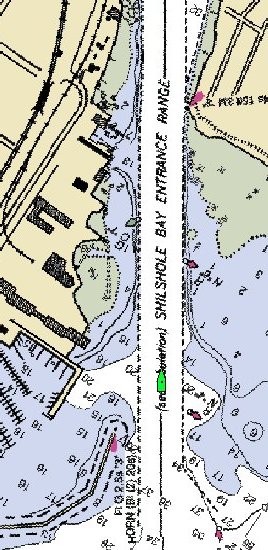
Traditional RASTER CHART running on Visual Navigation Suite. Note: Lack of clarity, upside-down soundings & descriptions. |
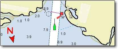
The same concept holds true for other objects on a vector chart (buoys,
lights, bridges, navigation symbols, etc) -- hold your cursor over the object,
and any relevant information will be displayed. This feature makes it much
easier for the mariner to decipher the various symbols used on marine charts.
Those that have used vector charts in
the past are undoubtedly familiar with a vector chart's ability to hide and
display different "layers". Layers include things like depth contours,
land features, navigation aids, etc. The ability to hide or display different
layers makes it easier for the mariner to only display the information that is
relevant to him/her.
 |
| See an animated GIF that demonstrates vector chart layer technology. The animated GIF cycles thru and displays an additional layer every 4 seconds. There are five layers in this example. |
This web page has shown you a mere sampling of the potential available with vector charts. Due to a vector chart's "intelligent" nature, a variety of exciting and useful features are possible
Vector Charts offer many benefits over other formats. Particularly Clarity, Precision and Power.
These are just a few of the things that can be done with vector charts.
Some of the Strengths of Vector Charts include:
Unlike raster charts, vector charts are a database of objects and information.
Given this, it is possible for users to easily retrieve information from the
vector chart database. For instance, in the vector example below, you can see a
yellow box that has latitude and longitude information and the words
"Anchorage Prohibited" in it. This box is displayed when the cursor is
placed over the Anchorage Prohibited symbol.
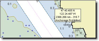
Passport chart showing tooltip popup containing detailed information.
Clarity is the same regardless of orientation
Due to their mathematical nature, vector charts remain sharp and clear at all
zoom levels or orientations (NorthUp, CourseUp or NativeUp). Notice how the old
style raster chart below is significantly more fuzzy (even with CrystalView
turned on) than the equivalent vector chart. You will notice the vector chart is
highly detailed.
Split image showing side-by-side comparison of raster chart (left) and vector
chart (right).
Text the same regardless of orientation
Note the orientation of the descriptions and soundings on the vector chart. Even
though the program is running in CourseUp mode, the soundings and descriptions
are readable and facing the user. On raster charts, the descriptions and
soundings would be upside down when the program is running in CourseUp mode.
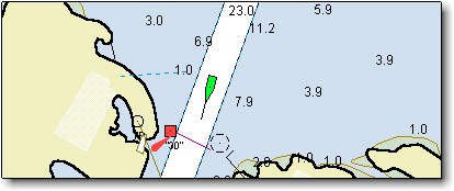
Chart image, north up.
Same chart image, course up. Note the text orientation is still right-side-up.
Data Filtering commands
Vector charts are often referred to as "intelligent" charts. For
example, when using a vector chart, the navigator can turn on/off various layers
(for example, the "depth contours layer" or the "lights layer").
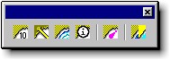
The Passport Chart control toolbar is used to adjust the display of Passport
Chart windows.
Passport chart with depth soundings turned on.
Passport chart with depth soundings turned off.
Depth units can be set by the user
Note that the soundings on the vector chart are in meters. Due to a vector
chart's "intelligent" nature, it is possible to display soundings in
whatever measurement units the user prefers (fathoms, feet, meters, etc).
Soundings shown in feet.
Soundings shown in meters.
Active Lights
When navigating, it can be difficult to match a light seen from a vessel with
those on the chart. The lights shown on Passport charts have additional
information associated with them, such as the range and bearing from which they
can be seen. Using this information, the software can change the way the light
is shown depending on the vessel's position.
The yellow arrow in the upper left corner points to a light which is out of
range to be seen at the boat's current position, so it is displayed as a dashed
circle.
When the boat is within visible range of the light, the light is displayed in
its proper (green) color.
Click Here to see an example of zoom levels to different
scales.
Chart size
Vector charts are very size efficient compared to raster charts. It is possible
to fit all of the charts for the entire world on one CD-ROM. The table below
compares some sizes of Passport charts to NOAA/ChartKit charts.
| Regions | Passport World Charts | NOAA/ChartKit |
| Region 4 | 8.05 MB | 241 MB |
| Region 7 | 6.67 MB | 190 MB |
| Region 15 | 4.97 MB | 185 MB |